
1. Print the outline of some text on grid paper
- Small grid squares make the final result look nicer, but it takes longer to render.
- If you make the text too small, you’ll have to squint to read it (this isn’t necessarily a bad thing)
- You can of course use any vector graphics, not just text.
- You can get some nice grid paper by googling e.g. grid paper PDF
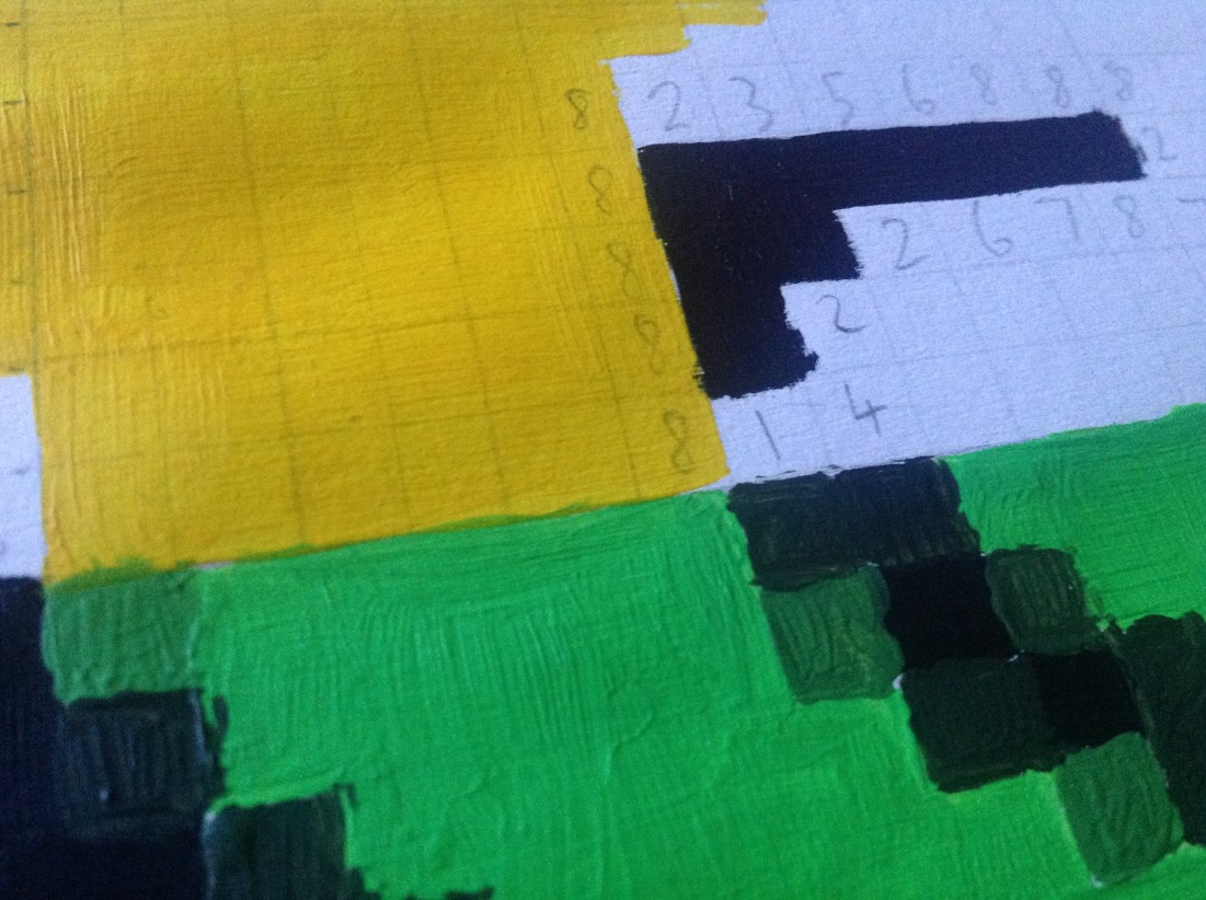
2. Calculate the coverage of each pixel
- Inspect every square near or on an edge, and estimate (on a scale from 0 to 8) approximately how much is covered by the shape.
- Why not 0 to 7? Because a 50% covered square would be 3.5, and that’s fiddlier to write.
- A larger scale (e.g. 0 to 16) will be more fiddly and painstaking (is that an 11 or a 12 coverage?), and would probably not make a noticable difference to the final quality. 0-4 would be quicker but I think 0-8 is the best trade-off between quality and speed.
- If you’re not paying attention around the fiddly bits (e.g. the bottom of the e), it’s easy to think a particular pixel is mostly covered by the shape, when it’s actually mostly covered by nothing (or vice versa). If necessary, resort to the even-odd rule.
- As a short cut, you can save time by comparing your current square with a recently calculated square. If the line angle and position looks about the same, and the previous square was 5, then the current square would probably also be a 5. This caching mechanism improves efficiency a little, but be prepared to invalidate the previous value if the line is gradually changing.
- I’m sure I made a few inconsistency errors, where I might have evaluated one square as ‘5’ and another (virtually identical) as a ‘6’, but it doesn’t matter.
- This step was quite time consuming, but it wouldn’t have been possible to accurately time the process because I was multitasking, nipping to the cafe, talking to people etc. I would estimate very roughly two hours.


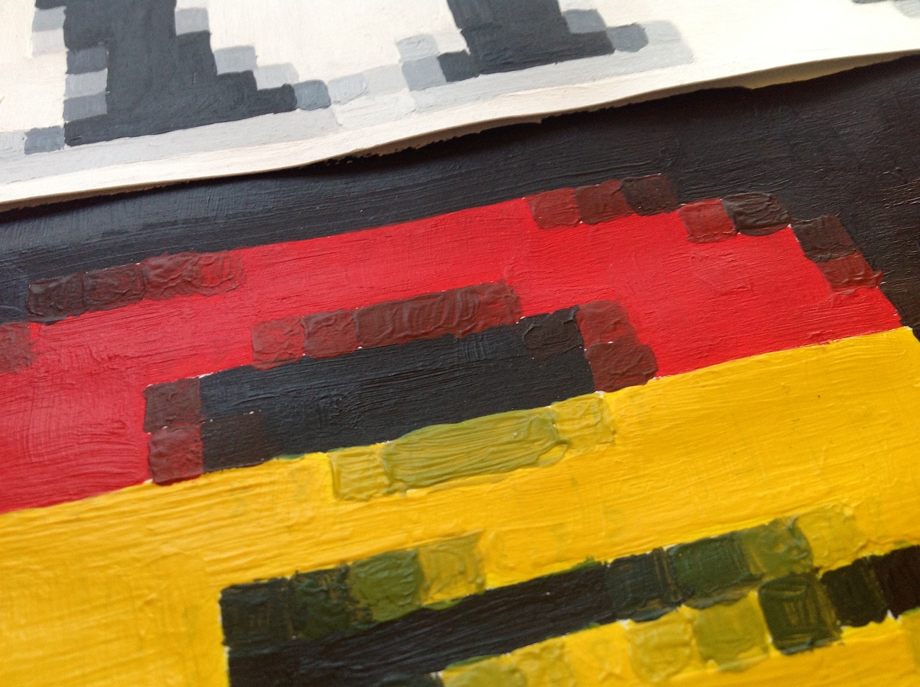
3. Colour each square according to the palette and the coverage value
- I needed to apply multiple layers to stop the numbers from showing through (but I got lazy, so you can still see them in places)
- The paint does provide a lovely texture.
- Drawing each pixel sequentially (top to bottom, left to right) is extremely inefficient – you’ll spend a lot of time ‘thrashing’ between different colours. Far quicker to paint all of the 8s, gradually add a tiny amount of black, paint the 7s, add a bit more, until you’re painting the 0s with black. However, in practice this sometimes resulted in an uneven distribution of shades – imagine a palette histogram where, instead of a steady and linear progression from yellow to black, it fluctuated in places.
- I can’t remember how long this took; I wasn’t doing any benchmarking.
- (I sometimes got paint marks on the bench, but that wasn’t on purpose.)
- I would estimate very roughly 4 or 5 hours ish.


Final result (looks nicer when viewed full size)
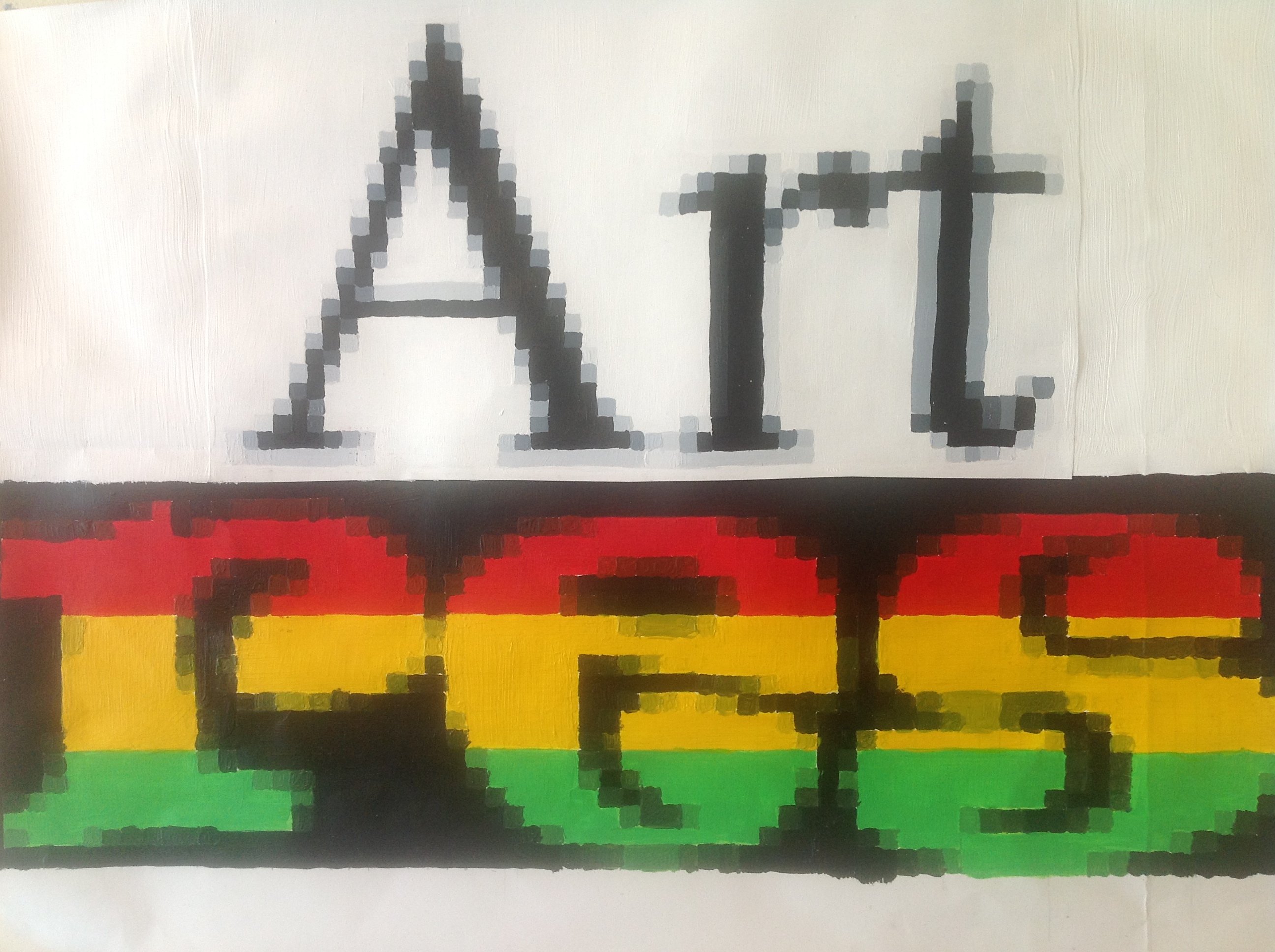
- It’s low res art, which is why the word ‘res’ is lower than the word ‘art’
- And of course it’s an anagram of ‘raster’
- Red, gold and green are the colours of the rasta religion.
- Thumbnail version:

Bonus image
- It was originally going to say “artism” but I messed up on this bit.
- The paint was all clotty and uneven; the red was too dark so it was an unsatisfying gradient from red to black; and in some places I got the colours wrong – e.g. on the far left.

Bonus cake
- If you enjoyed this article, you might also like to see my pixel art cinnamon cake.

Pingback: This rendering algorithm is incredibly slow (aka Cinnamon Cake Pixel Art) | Writing a Flash player. In assembler.