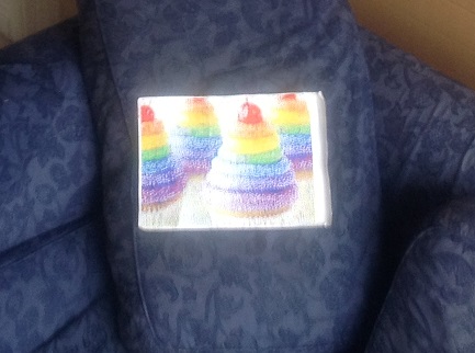
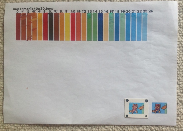
Previous attempt
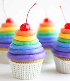
Last year I painted some “pixel art” cupcakes.

I was reasonably satisfied with the result, but felt I could do better:
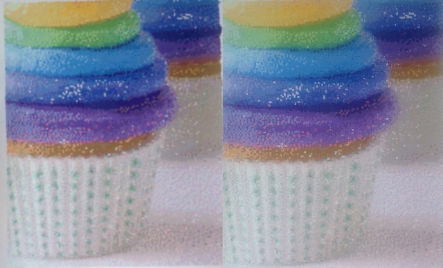
- I had accidentally stretched the image vertically (compare the painting on the left with the original on the right)
- I slightly regretted that I had chosen to focus on the colourful frosting instead of the relatively empty space at the top or the softer shades around the paper cases.
- The “art room” palette (i.e. whatever sixteen or so paint colours happen to be available at the time) was a little inadequate – note the noisiness of the blue frosting layers caused by not having any pale blue paint, or the “hundreds and thousands” RGB noise which attempt to render the blurry paper cases in the background.
- I might have been able to get away with this if it was a sufficiently high resolution (and accordingly if the picture was viewed from a distance).
It was time for an alternative approach – create a custom palette suited to the picture.
More colours, more pixels
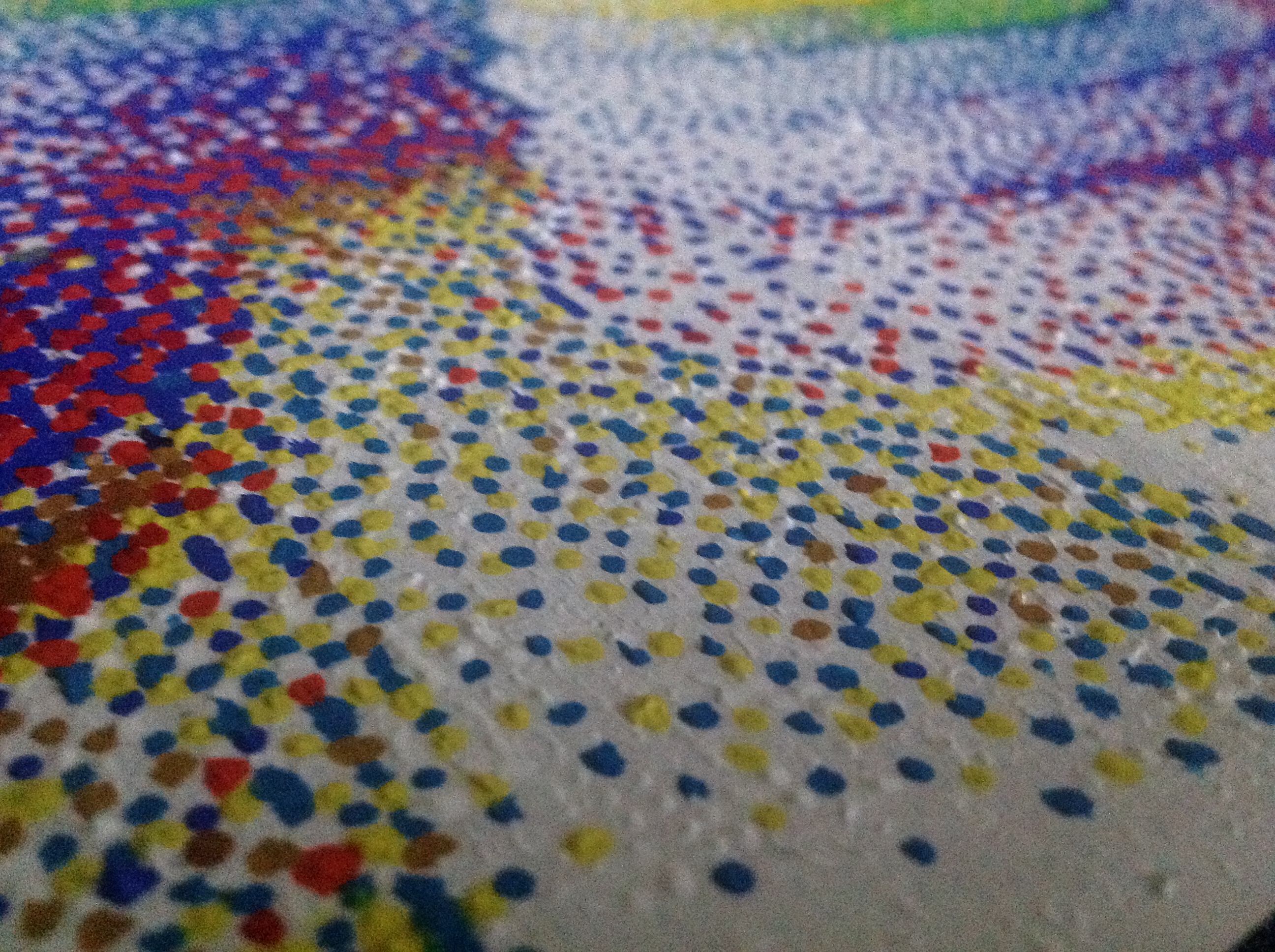
The original photograph is 640 pixels by 740 pixels, and contains almost 125,000 different colours. To render a painting with that resolution and palette would take me approximately 400 years, assuming I work 60 hours a week and 52 weeks a year, and that’s assuming I have the visual acuity, patience and general ability to distinguish between and correctly mix almost identical colours.
I therefore needed to reduce the resolution and palette. Too low and it would not be much of an improvement over the first cupcake picture. Too high and it would take too long to finish. The pixels themselves need to be “the right size” – big pixels require the viewer to be some distance from the painting, small pixels would make it difficult to read the numbers on the paper or to paint the pixels precisely without overflowing onto neighbouring pixels.
I settled on a resolution of 256 x 320, slightly arbitrarily (it’s the screen resolution of “mode 13” in RISC OS, which I had used for some of my pixel art software) and to use roughly the same size pixels as before (2mm x 2mm). This would span across four pieces of A3 and result in a painting that is almost A1 sized.
The next question – how many colours to use? Anything less than around 20 was out of the question (because that would only be a tiny improvement over the first cupcake painting). But too many colours could be impractical:
- The more colours in your palette, the more similar they will be.
- The more similar they are, the more important is to be precise when mixing those colours, otherwise you could (for example) end up with two different colours mixed identically. In which case, why bother having so many colours? More precision equals more time and frustration.
- Real world variables like lighting, paint moisture, paint texture (flat vs bumpy) make it pointless trying to be too precise.
- The colour swatches (see below) are printed using software, files, printers and paper that are all capable of introducing their own variations and errors. (Especially if you opt to save money by not splashing out on expensive photographic paper).
- Some colours/hues/whatever are harder to tell apart than others (very light or very dark colours are especially tricky), and a photo editing program is unlikely to optimize for this.
- You get “diminishing returns” with too many colours – 200 colours isn’t noticably better than 100 colours.
- The greater the number of colours, the more digits needed to represent them all. The more digits you use, the smaller they need to be. If you want to use more than 10 colours you’ll need double digits, more than 100 colours and you’ll need triple digits etc.
- You can use non-numeric digits to extend the range (e.g. hexadecimal to give you 16 colours or alphanumeric to give you 36 colours) but it can be tricky distinguishing between 8 and B, 1 and I, 0 and 0 etc. Even telling 5 and 6 apart can be tricky when the numbers are tiny and the paper is worn
- Economy of action – if you have 60,000 pixels and 32 colours, that works out to be approximately 1875 pixels per colour, so having spent an hour or so very carefully mixing a particular colour, there is at least the sense that you are “getting your money’s worth”. If you are mixing up 200 colours then you’re only getting approximately 300 pixels from each batch.
- Why did I say 60,000 and not 81920? Although the resolution of the picture is 256 x 320 (81920 pixels), approximately one quarter is taken up by a very pale blue background.
Three random links:
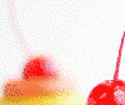
After fiddling around with The GIMP I settled on the “round” number of 64 colours. This produced an image with a few odd pixels, which I guess are technically correct (with regards to maintaining the RGB balance of the Floid Steinberg dithering algorithm?) but aesthetically dubious. For example, the scattered pink pixels in the background, or the dark pixels to the left of the frosting:
I somewhat arbitrarily tweaked some of these odd pixels at the editing-on-computer stage and others when I was actually painting (either by omitting them or by painting them “correctly” and then changing my mind and painting over them with more aesthetically pleasing colours). In some cases, I just went along with the suggested colours (even if they looked a bit wrong) and painted them anyway.
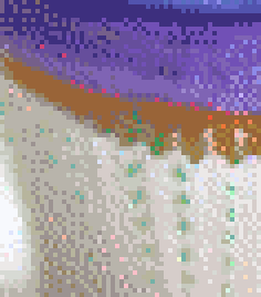
Some “odd” pixels are merely artifacts of the actual objects, like the green and pink pixels amongst the brown, that are caused by the imprint of the frilly paper cases against the cupcake:
Preparation
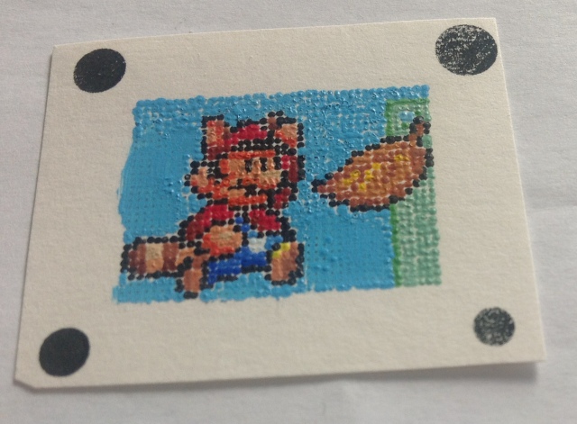
The previous cupcake painting simply consisted of a piece of paper with a grid of numbers with each number corresponding to a named paint colour (e.g. 7 = “burnt sienna”). There was no need to create my own custom colours, and as most colours was found in abundance all over the canvas there was no need for any planning or strategy – just dip the brush in the paint and start anywhere.
However, this project required two additional guides – maps and swatches.
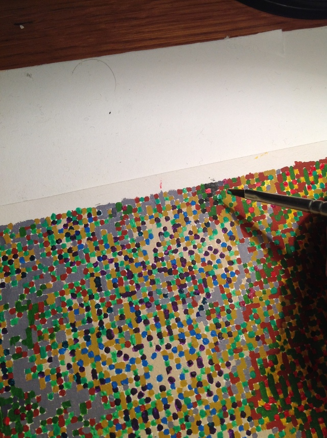
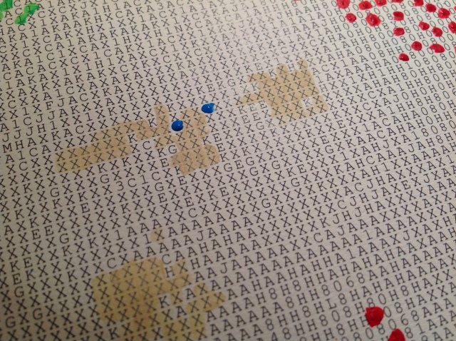
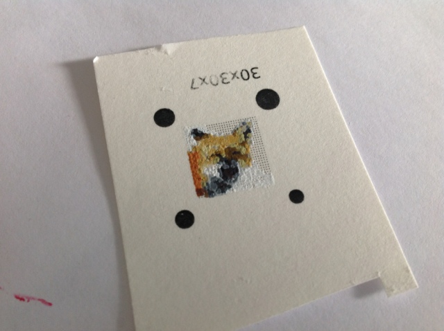
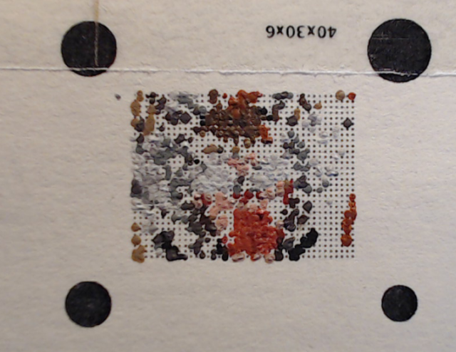
Maps show where each colour appears within the canvas. For example, this is the map for colour 33 – a slightly orangey pink. Two maps per A4 page. I would then manually crease each map into four segments – remember that the entire photograph is four A3 pages.
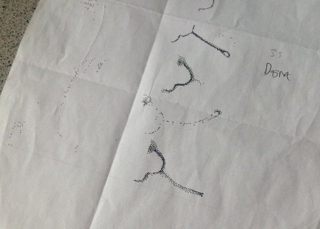
A few colours were found in very tight clusters (typically around a particular colour of frosting) and these might be reasonably possible to paint without a map. However, most colours were scattered around all over the canvas (a cluster here, a few pixels there) and for this reason the maps were essential.
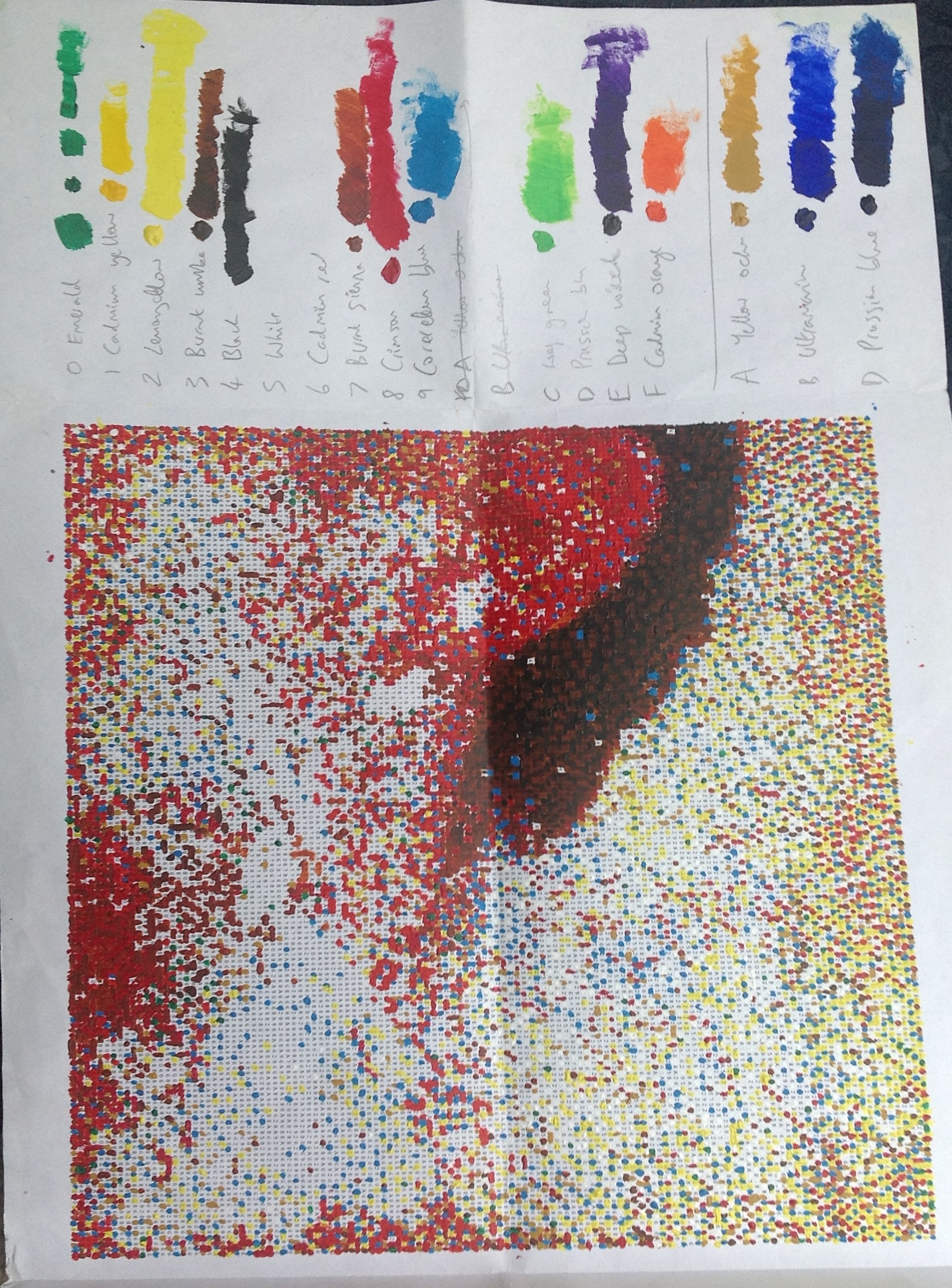
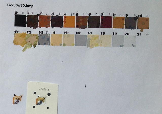
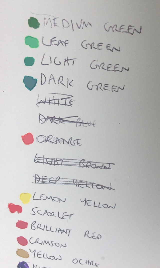
The somewhat tatty piece of paper shown below contains swatches for each of the 64 colours. By dabbing a small amount of paint (and then allowing it to dry, which causes it to darken very slightly) I could check whether my paint matches the swatch. When it does – and it often took me on average ninety minutes per colour to get satisfactorily close – it was time to start painting the pixels.
“Every colour tells a story” – well, I could probably comment on about twenty individual colours, but it wouldn’t be tremendously interesting to read. Some were harder to mix than others. A few were frustrating. A couple were virtually impossible without the right paint – trying to mix some pinky/purpley colours just by mixing red and blue just didn’t bloody work (you need a paint with a “red” tone or something). One or two colours were mixed virtually identically to the swatch (for sake of argument let’s call that “100%”); most were very close (“85%”), some were reasonable (“70%”) and a few were done quite shoddily (“60%” or below), possibly because I was still finding my feet with the colour mixing.
It was only near the very end that I realised the importance of inspecting the swatches under natural daylight instead of artificial lighting.
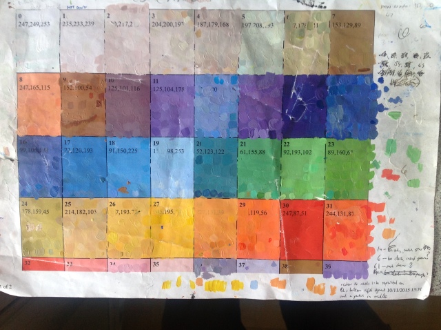
As a rough rule of thumb, the more blobs of paint covering each swatch, the harder it was to match accurately. Sometimes I ran out of space (having painted over the entire swatch) and had to try to match the paints left between the blobs – tricky.
Each swatch was accompanied by a triplet of red/green/blue values because I thought this might prove useful. In practice, it rarely did.

Colours 12, 13 and 15 were tricky. Sometimes blues can have a tiny element of purple in them – but contrary to my naive understanding of colour, merely adding red just doesn’t work. Similarly with colour 48 (funky pink).
Colour 47 was a right awkward sod as my margin comment will testify.
I now have a deeper appreciation for those paint-mixing contraptions at DIY stores, and the eyedropper “colour selector” tool from Photoshop/GIMP/etc.
Painting
The actual painting of the pixels was easier than the colour mixing.
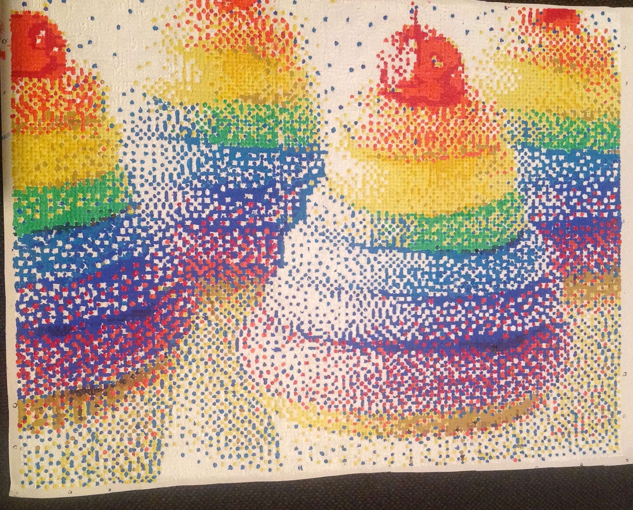
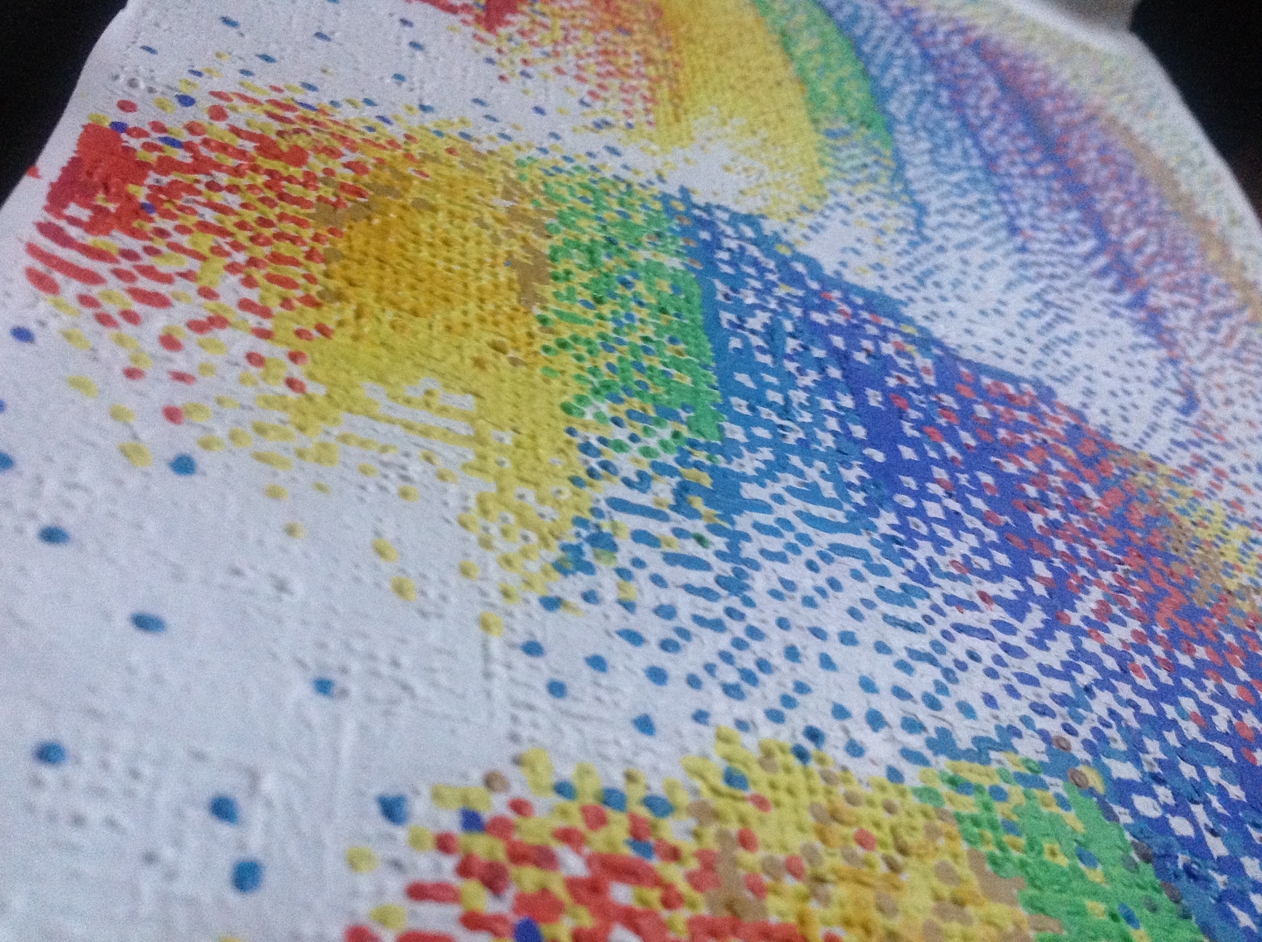
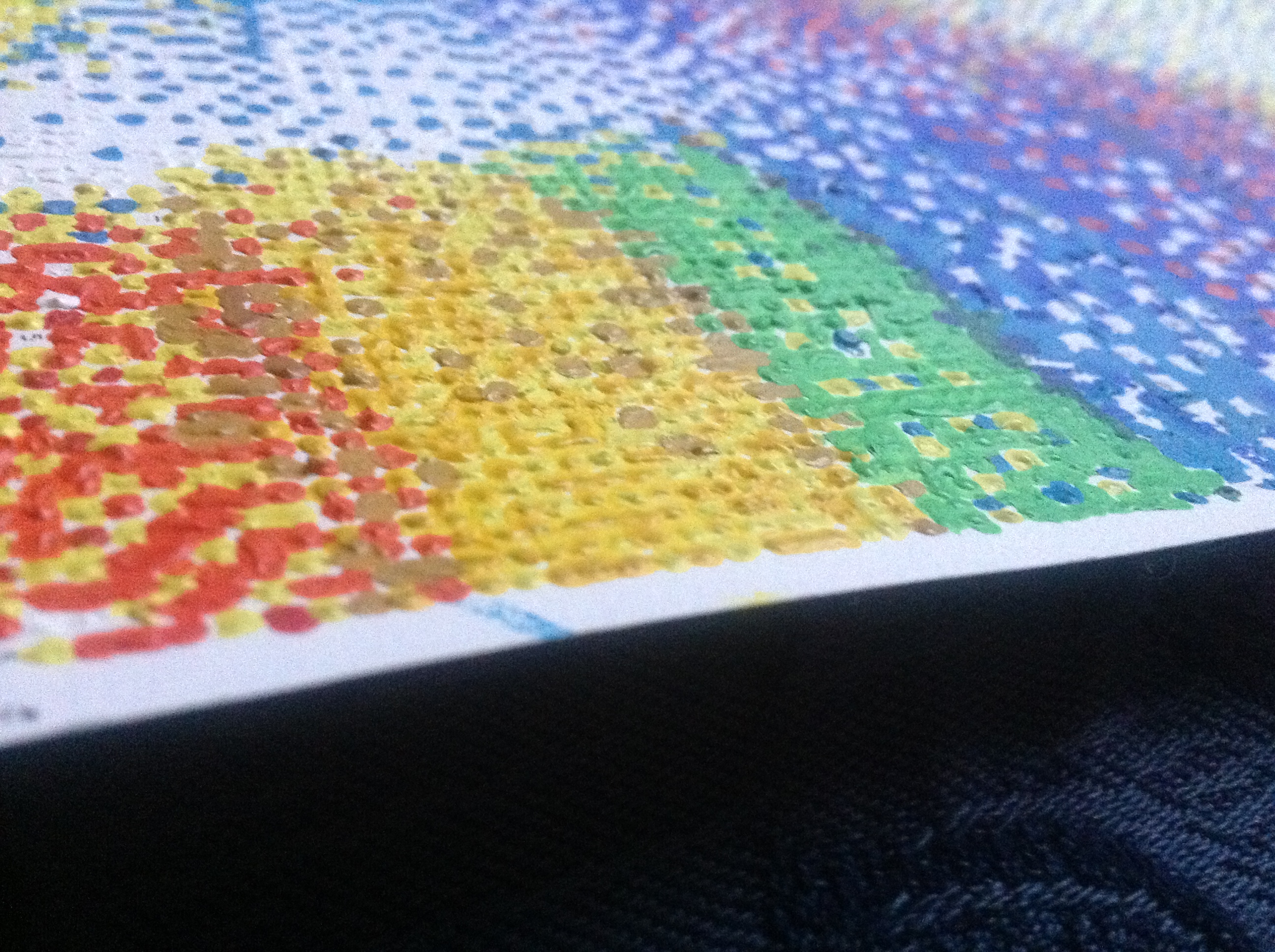
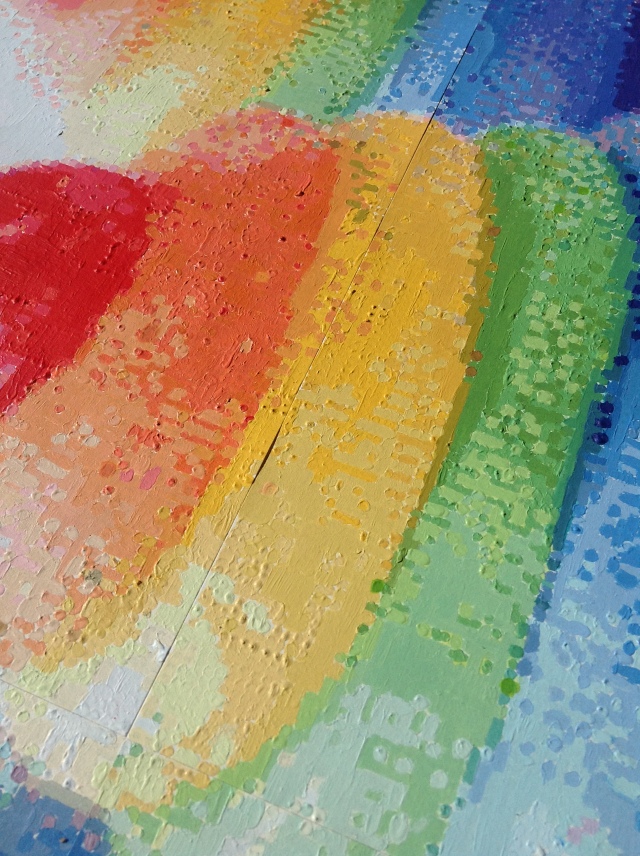
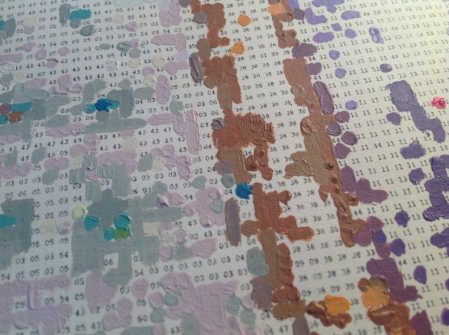
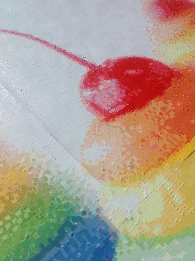
The first several colours I painted were not really done very well. In the picture below you can see several spikey blobs (especially in the red cherry) and some flakiness in the orange area due to (if I remember rightly) dry paint. Tall spikes are a problem because they cause shadows if the lighting is not directly in front of the painting. I didn’t worry about spikey pixels at the beginning – if anything, I preferred the texture and character they added to the painting – but later changed my mind.
Another mistake I made early on was painting pixels as small round blobs rather than squares. (Screen pixels might not be square, but mine certainly are). This results in small white corners where the paper shows through, which can be noticable around dark colours. You might be able to spot a few in the picture below: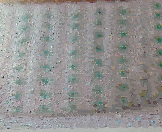
One solution to the “white corner problem” is to carefully mix up that colour again and paint over each pixel, this time around ensuring that the entire square is covered (and also being careful not to accidentally cover any adjacent pixels). This can be quite time consuming and error-prone if there are any similar colours nearby. A quicker approach is to carefully dab some watered down pale paint in the corners (e.g. pale orange for orange pixels, pale green for green pixels etc), thus changing the white corners into off-white. Not perfect, but it takes the “edge” off the whiteness and is a lot quicker and easier than remixing various colours.
Another defect are pixels which were only painted with a thin layer, causing the number to show through the paint. This typically happens with pale colours like yellow, and can be avoided by placing blobs of paint rather than thin layers.
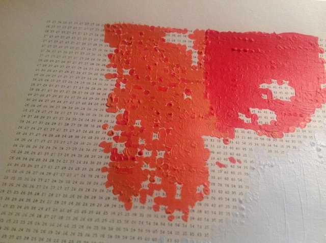
Towards the end of the painting I did a few tweaks, such as remixing and repainting a couple of colours (2 and 4, if I recall correctly) because the paper case in the background on the right hand side was a tiny bit too brown and dark. The result is 3% less magenta, 1% more yellow and 1% less black. Compare the very slight difference:
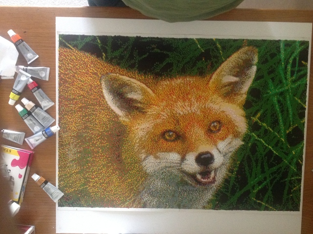
Over 300 hours later…
I started in November 2015 and worked on it approximately eight hours a week for the first few months and about thirteen hours a week for the last few months, including a few six hour evenings.
The original photograph is a beautiful image, with gorgeous three dimensional cupcakes in the foreground, soft (and almost two dimensional) cupcakes in the background, and the detail of the green dotted paper cases.
My painting, by contrast, is a horrible mess! An imperfect, organic creation with blemishes and mistakes which makes the original even nicer in comparison. Its misdemeanours include…
- Oddly coloured pixels caused by the algorithm
- Flakey squares caused by dry paint
- A streaky background – I should have used a thinner paint and a brush that didn’t keep shedding its bristles
- Thinly painted pixels where the number can still be seen through the paint
- Small pixels which had been painted as small blobby circles rather than large squares, thus creating small white corners around each pixel. This is prerty much harmless for light coloured pixels but creates visual noise around dark pixels.
- Sometimes I cheated by filling in these white corners with the same paint as neighbouring pixels, but this causes a colour imbalance where the surrounding colour ‘overbears’ the inner colour
- Inordinately spikey pixels (small blobs are fine but spikes cast shadows)
- One or two places where I attempted to repaint an area but gave up because I couldn’t match the colour just right with the paints I had, thus leaving it with slight blemishes.
- Downright incorrect colours – the numbers are very small and once the ink has been worn off by constant handling it can be impossible to distinguish between 5 and 6, for example.
- Off colours – near the end of the project I had a few left-over pixels to paint, and these colours were not mixed to the usual high standard
- Slightly off colours – at the beginning, some colours were not mixed to a decent standard; and even towards the end there were times when I ran out of time/patience and thought “sod it, this is good enough”
- and if you look carefully you can see the seams where the four A3 pages have been carefully joined together.
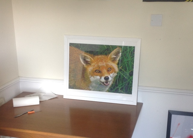
Many of these imperfections cannot be seen unless you know exactly where to look and what to look for; many are so inconsequential that you might not find them even if you do know where to look, and virtually none of them can be seen if you stand a few feet away.
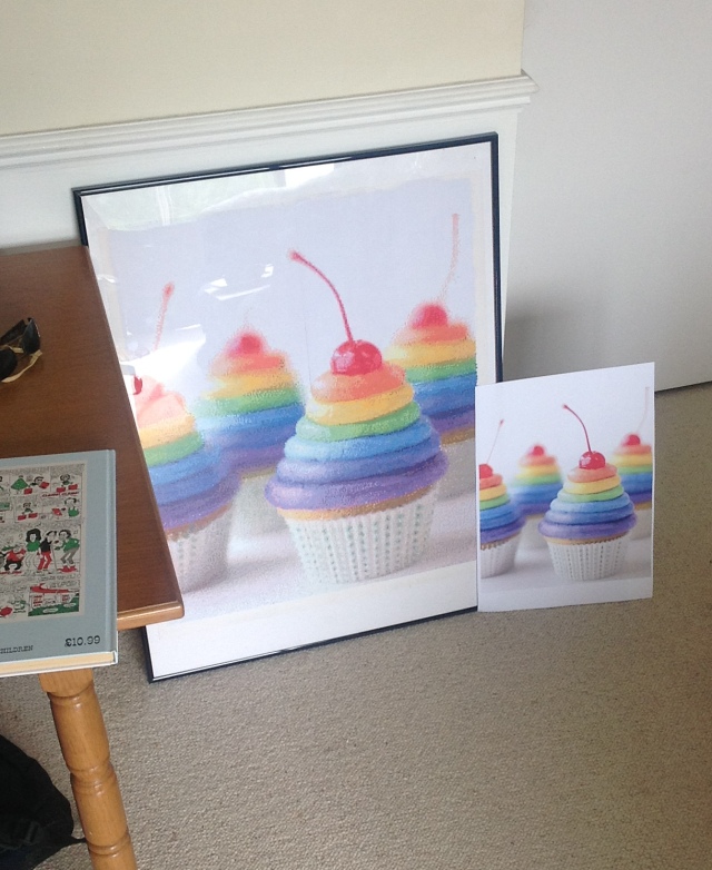
Original photograph shown for comparison:


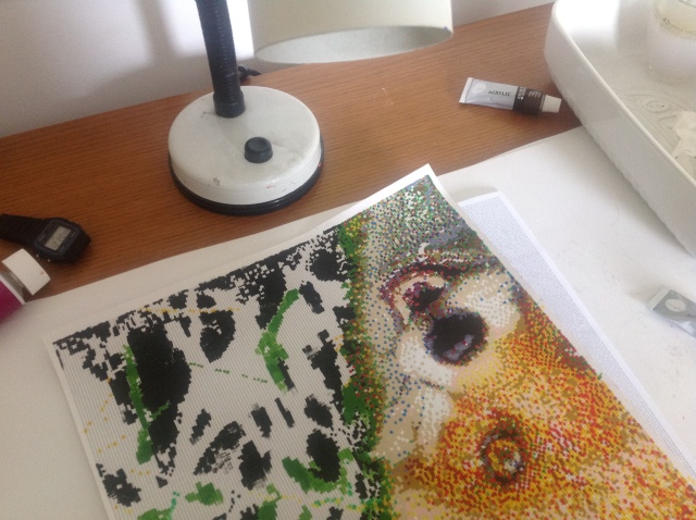
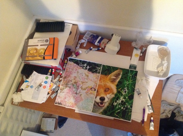
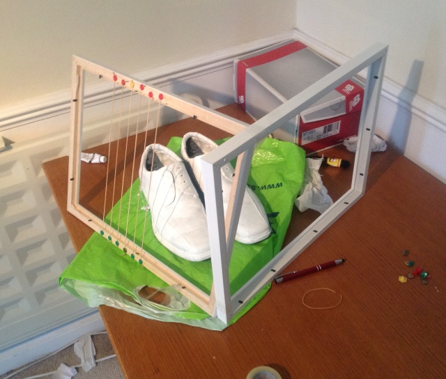
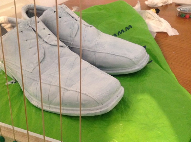
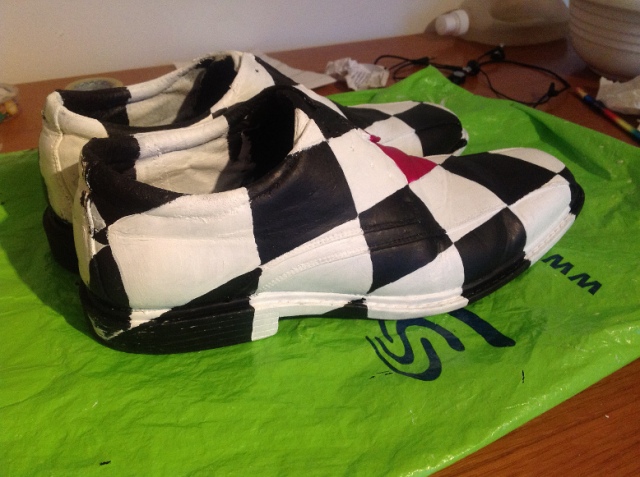
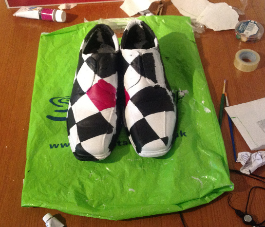
Studio / Development pictures
Having painted all 64 colours I should be finished – right? Nope, because there were around 100 unpainted pixels that had somehow got overlooked. So I then needed to spend several more hours figuring out which colours needed to be remixed. (I didn’t spend quite as much time mixing them this time, as I was only repainting a few pixels for each colour. But they still needed to be reasonably close).

So many colours..
Trying to mix up an elusive shade of orange just right. (Note: the paint wasn’t actually that glossy; that’s just the lighting)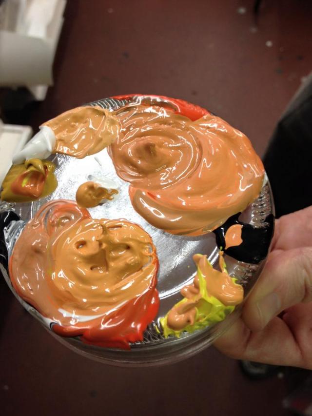
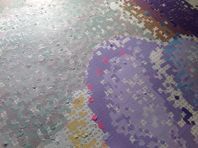
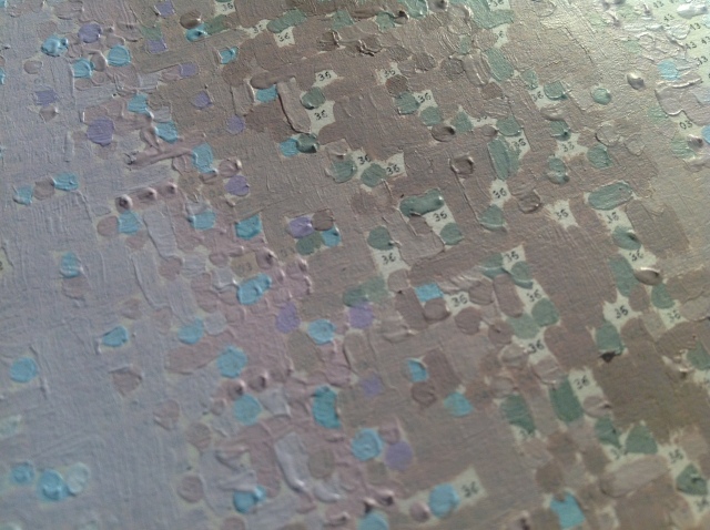
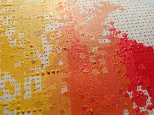
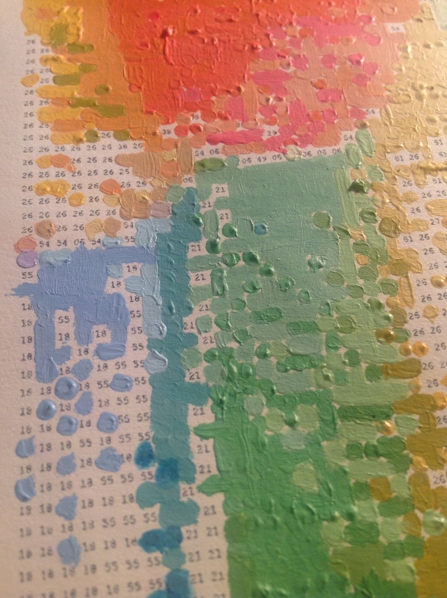
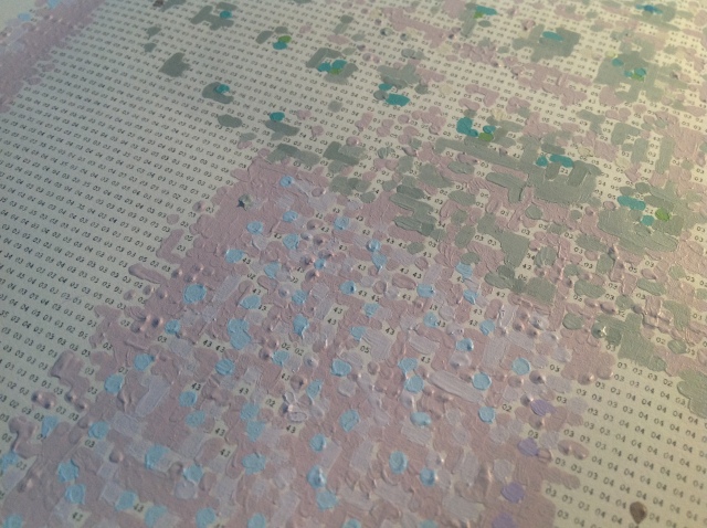
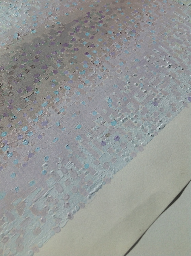
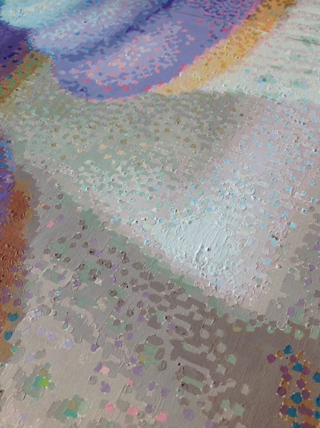
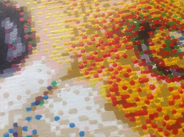
Close ups


Thanks to Sprinkles Bakeries for giving me permission to paint her gorgeous cupcakes, the wonderful Lisa for her support and everyone from my art group.


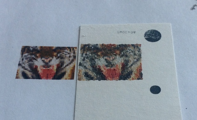


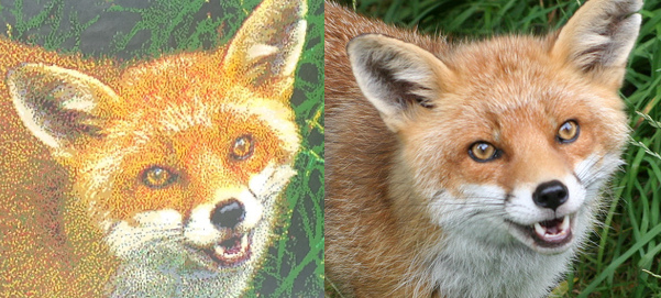
 In a nutshell: paint a small blob of every colour onto a piece of paper, photograph it, extract the RGB values, feed into the algorithm. I didn’t photograph the colours properly so the end result isn’t quite right. It’s very noticable if you compare it with the original photograph, but I think if you’ve never seen the original, you’d be none the wiser.